This week's tutorial required high contrast image. I have picked image of Colosseum and chess.
First, I started with Colosseum and removed lights and replaced it with negative space.
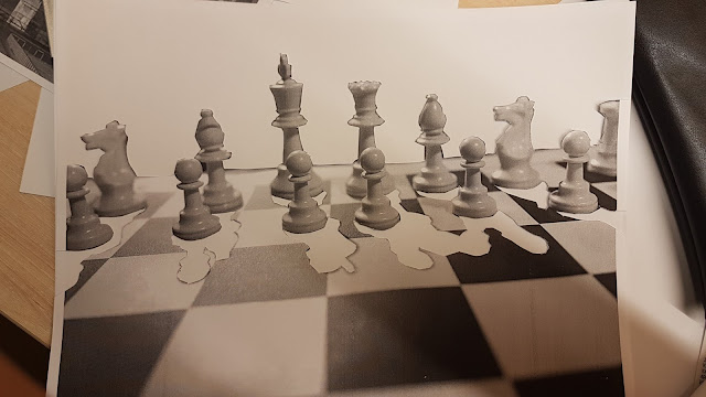
On my second image. I removed pieces' shadows. Put white paper behind it to have positive space.

After making this I have learned meaning of positive and negative space a lot better than before. It was my first time doing this and it was very nice to make something like this. Removing lights from the Colosseum made it feel very dark and creepy. While cutting off the lights, the place looks empty and so dark that it could be a horror movie place.
In the chess image, I was expecting the shadows to mess up the chess platform but it didn't have much effect. Also removing the background from black to white didn't really change the original image. It felt like I just flipped the dark and white in this image. But when I look at the shadows then I can see the pieces and what they are.
First, I started with Colosseum and removed lights and replaced it with negative space.
On my second image. I removed pieces' shadows. Put white paper behind it to have positive space.
Then I have cut the background away also and replaced it with positive space.

After making this I have learned meaning of positive and negative space a lot better than before. It was my first time doing this and it was very nice to make something like this. Removing lights from the Colosseum made it feel very dark and creepy. While cutting off the lights, the place looks empty and so dark that it could be a horror movie place.
In the chess image, I was expecting the shadows to mess up the chess platform but it didn't have much effect. Also removing the background from black to white didn't really change the original image. It felt like I just flipped the dark and white in this image. But when I look at the shadows then I can see the pieces and what they are.


Comments
Post a Comment